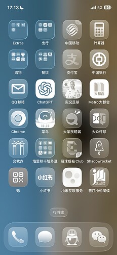
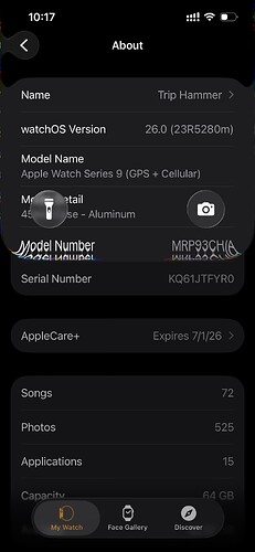
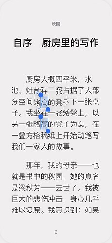
But the real interface is also so ugly, I feel ![]()
I think it’s good-looking, but it’s very laggy
iPhone12pro
Isn’t this the jazz style we were just playing on the Huawei Mate 7? ![]() Next time remember to cite the source
Next time remember to cite the source
Monochrome really doesn’t look good… Is this an official image this time? My hanging heart finally died.
This damn is my phone…
And this one is adjustable, bro just likes the pure transparent glass color so uses it.
Is the battery life reduced significantly?\nI heard another blogger say the battery life is only one‑third of the original.
Not that exaggerated
Slightly warm, slightly laggy (beta version is normal), today screen-on time 4h9m, battery usage 77% (note that this is a four‑and‑a‑half‑year‑old iPhone12pro with 77% battery health).
After using it for a few days, I noticed an issue: the transparent glass effect emphasizes the edges rather than the interior, which visually feels a bit overwhelming. Then, during the pull‑down of the Notification Center, the areas covered by the glass are instead highlighted, which doesn’t match the intuitive sense of “covering” and also doesn’t meet the functional requirement of the glass layer highlighting the notification content.
Also, the transparent Assistive Touch often blends into the background ![]()
Damn, this edge effect is awesome ![]()
Why does it feel like a magnifying glass effect
Looking at it a lot makes me a bit dizzy
But it’s said that this is real-time ray tracing calculation ![]()
It looks garish. Feels like a subtle “light pollution” ![]()
So this thread has been discussing for so long without posting any pictures?
Then I’ll contribute another one
The magnifier indeed also uses a glass effect, take a look at the result
It is calculated locally in real time; although it’s a beta1 version, there is very little stuttering, and there hasn’t been more power loss; technically, it’s quite impressive.
The biggest problem is that it’s too transparent, the hierarchical relationship wasn’t handled well, and I don’t know how it will be modified later. For example, this is the preview interface when uploading images at Jiaoda Gate—can you tell how many UI layers are stacked together?
The answer is 4 layers.
LOL, Apple is so high‑tech, I’m a country bumpkin and I really can’t appreciate it ![]()
![]()
My eyes are going to go blind ![]()
I really can’t appreciate this. If it’s always like this in the future, I really don’t want to update the system ![]()
This must be an extreme scenario; I was shocked when I first saw it, I couldn’t tell which button was on which layer, what the checkmark in the lower‑right corner means, and
how to exit the preview interface.


